R: Precipitation by Different Climate Change Scenarios
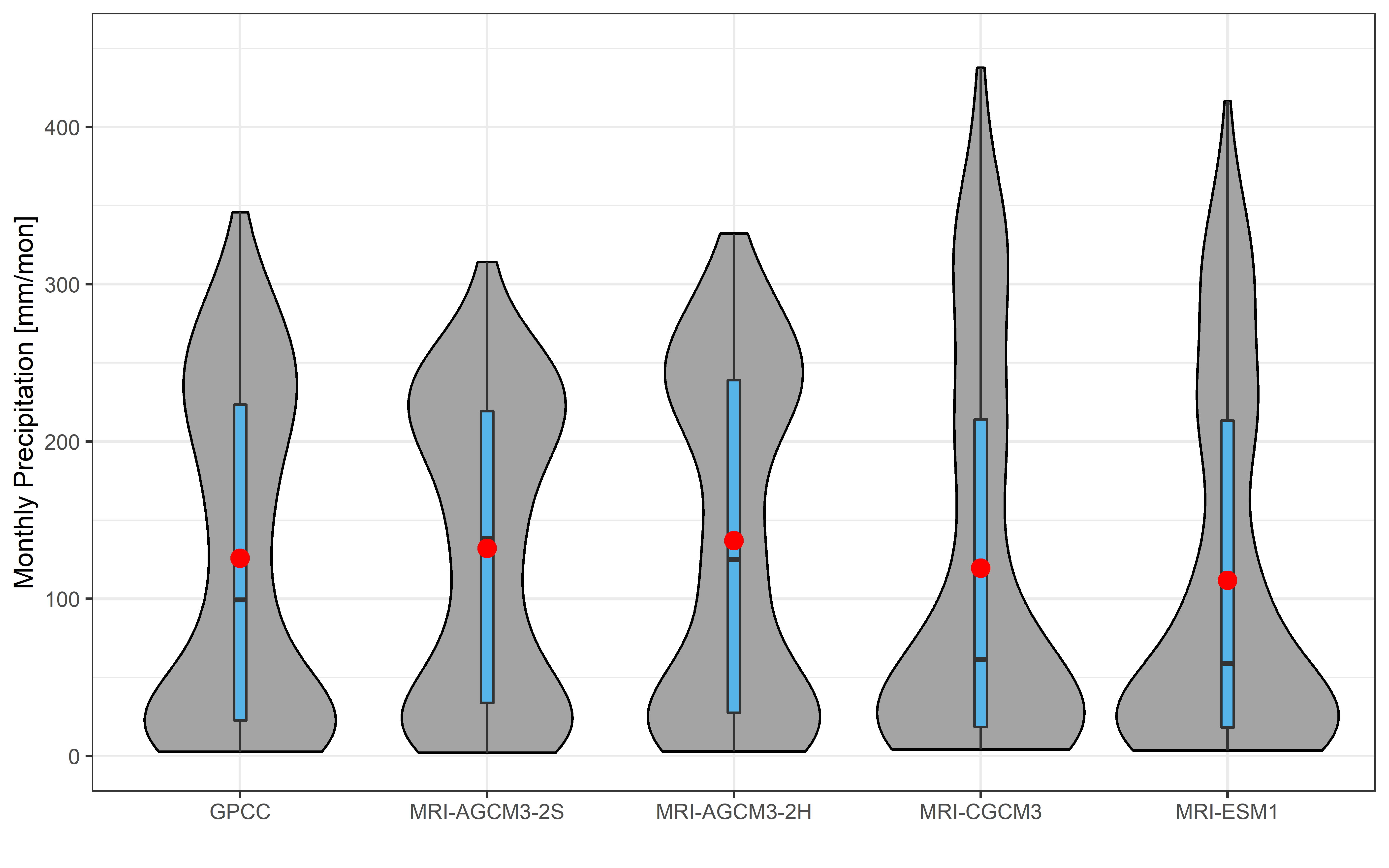
Here I will show how to plot bar chart with line graph to show monthly precipitation by different climate change scenarios with the code written in R.
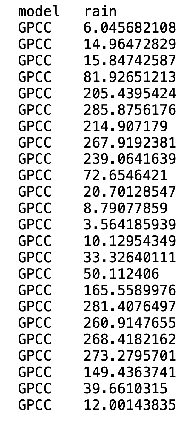
1. Data Table
Data source name: monthly_rain.txt

2. Code
---
rm(list=ls())
library(readxl)
library(ggplot2)

setwd("C:/Users/tryso/Google Drive/Sophal_Kyodai/D_Eng/3.Future_projection_disc_inun/plot_spatial/compare_AGCM")
rain = read_excel("monthly_rain.xlsx",sheet="25years")

m1 = rain$gpcc
m2 = rain$agcm20
m3 = rain$agcm60
m4 = rain$cgcm
m5 = rain$esm1

mm1 = mean(m1)
mm2 = mean(m2)
mm3 = mean(m3)
mm4 = mean(m4)
mm5 = mean(m5)

# Violin plot
rr = read.table("monthly_rain.txt",header = T)
rr$model = factor(rr$model, levels = c("GPCC", "MRI-AGCM3-2S", "MRI-AGCM3-2H", "MRI-CGCM3","MRI-ESM1"))
png("violin.jpg" ,width = 8, height = 5, units = 'in', res = 700)

pp = ggplot(rr,aes(x=model, y=rain)) +
  geom_violin(trim=TRUE, fill='#A4A4A4', color="black") +
  geom_boxplot(width=0.05,fill='#56B4E9',coef=5) +
  stat_summary(fun.y=mean, geom="point", shape=20, size=5, color="red", fill="red") +
  xlab(" ") + ylab("Monthly Precipitation [mm/mon]")+
  scale_y_continuous(breaks = seq(0, 450, by = 100),limits=c(0, 450))
pp + theme_bw()
dev.off()
---
3. Plot

Source code is available at: GitHub


